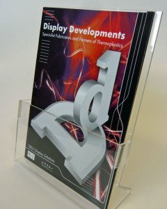
Leaflets can make great marketing aids. They have a direct appeal and can be an effective way to raise awareness of goods and services. Of course, there is no point in managers spending their time and money on these items if no one gets to see them, and this is where leaflet display stands come in handy.
 By investing in leaflet holders, bosses can ensure that these promotional objects get the exposure needed. The holders can be placed in shops, reception areas and elsewhere.
Before getting to this stage though, it is necessary for business owners to design attractive leaflets that get their messages across. Luckily for anyone who is lacking in the relevant knowledge and experience, there is plenty of advice available online.
For example, Royal Mail has offered a series of tips to help firms create the best possible leaflets. It suggested that when designing the marketing material, people should always keep their customers firmly in mind.
It also suggested that “shorter is better”. On this subject, the organisation remarked: “Your customers want information they can immediately understand. If you try to tell them too much, they’ll lose interest. Instead, give them a headline, an image, a small amount of text with a clear call to action.”
The firm also pointed to the importance of using a clearly legible font. About this, it commented: “Choose a typeface that your audience will find easy to read. Complicated or comical typefaces do not make your message clearer or provoke interest. Just the opposite. Your goal is to make it easy for your customers to read your leaflet.”
While this may seem like an obvious point, many leaflets are let down because their creators opt for unsuitable typefaces. First and foremost, people need to be able to read the material. Therefore, legibility should take precedence over beauty.
On the overall layout, the firm stated: “Your headline belongs in the top third of the first page. If you can get your customers’ attention within three seconds, they’re more likely to keep going. Colours can help make your layout look more unified. Try putting your headline in one colour, the body copy in black and the call to action in the same colour used in the headline. Or consider a simple line that frames your block of writing or your photos.”
The company also recommended including a call to action on leaflets. According to the mail service provider, it is important to draw attention to what it is customers should do. It stated: “Leave enough space to make your call to action stand out. Even something as simple as phone now for an appointment should be easy for your customers to see.”
One of the great things about leaflets is the fact that they are inexpensive. This may be particularly appealing to firms that are feeling the financial pinch at present. Meanwhile, leaflet display products do not have to cost much either. As long as bosses know where to look, they should succeed in finding versions that represent superb value for money.
About the Author – Anna Longdin is a freelance blogger who has written extensively on the subject of marketing for a variety of websites, including Display Developments.


